Inspired by Kandinsky Arrow Form to the Left
09 June 2004
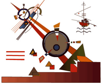
I was really inspired by kandinsky at college. A lot of his paintings layer straight lines and primary shapes creating a vibrant dynamic energy. I thought I'd have a bit of fun with this one exploring the movent in the picture and at the same time have a go at using flash for the first time!
Zen of the A470
09 December 2004
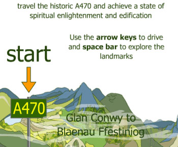
Designed during the Dimension10 training scheme with project partner Mike Burvill, the brief was to design a fun obstacle game in which the user has to navigate a car from North to South Wales along the notoriously long and slow A470. Along the way they'll encounter problems such as the ubiquitous log lorries, crawling caravans, stray sheep, etc. Small graphics should be incorporated depicting major landmarks.
Research was compiled and design ideas were storyboarded. The look and feel of the graphics and game play was finalized during the production process.
In order to provide a visual structure for the project a map of the entire road, from Glan Conwy to Cardiff, was printed out (sourced from multimap) and stitched together in Photoshop. Photographs and descriptions of the landscape around the road, specific landmarks and points of historical interests, specific events sourced from the Internet were collected and linked to the map. Friends and colleagues were asked for their experiences of the A470. Write ups of the exhibition ‘A470’, commissioned in 2001 by Ffotogallery in Cardiff and Oriel Mostyn in Llandudno, was a useful source for ideas and impressed upon us the historical and social significance of the road.
We story boarded ideas for the look of the game and game play and experimented with the views, either from the drivers point of view or using platform format.
A main feature of the road is the changing landscape. By using a montage of photos representing significant features along the route and stitching it together as if it were one constant landscape we created the basis for a background illustration. This was then produced cartoon style as a vector graphic. As vector based illustration lacks photorealistic fills, the colour palette was chosen carefully to represent the feel and ambience of the landscape.
In order to take the drivers view we decided to use a simplified version of the idea of parallax; things in the foreground move quicker than in the background. Because of the time restriction of the project we used just one background image (the landscape) and the foreground motion (roadside telegraph posts). Even though it was simplified version of the concept, the relative movement of the two layers gave a reasonable impression of moving through a landscape. If there had been more time another layer in the mid ground would have improved the look and game play.
Although we developed the brief to the best of our ability within the time constraints.
Phase II
One issue we were disappointed not to have time for was to slowdown the car when behind an obstacle. This would give the game a much more realistic feel and give the player a reason to try and overtake.
Due to the unpredictability of the welsh weather it can be a gamble to attempt a journey on the A470. Equally depending on journey time and time of year the amount of daylight would vary. To really get the feel for the road change of time of day and weather conditions, perhaps by periodically darkening and lightening the screen.
More vehicles as obstacles, such as caravans and cows and sheep would add to the variety and interest of the game. We had storyboarded the possibilities of livestock on the road, and changing the log lorry graphic to a caravan or a C reg reliant robin would be easy.
More functionality incorporating the idea of meditation to make the journey easier and more pleasant, we had the idea of using a key press (perhaps ‘M’ for omm) to clear obstacles.
Visual Perception: Photography
12 January 2005
Events caught on film are often thought of as truth as they describe an exact copy of what occurred. This capacity to document the world is unique to photography. Once the photographer has decided on the composition of the scene, light from this scene is focused by the camera and is captured by chemicals on the photographic film. In this way the camera records all of the details that are visible in the whole scene.
Although it may be the case that a photograph captures the truth of a moment in time, I was interested in the concept that we never see the world like this, in the state of time standing still. An event can only be fully understood by us in its context; by what happened before and what happened after. When the photograph is taken and the image frozen we might wonder how and why the subjects and/or objects got there. Are they taken from a real setting or has the composition been created as a still life or a dramatic pose. This is part of the wonder that we sometimes feel when looking at a photograph.
‘The Terminal’ by Steiglitz (1893) is to me a beautiful photo because despite the rough, unsophisticated subject, it portrays the moment in an intimate way. A picture of a tram arriving, the photograph tells a simple story of a snowy day in urban New York. The cold atmosphere of day comes across in the dirty snow on the ground and the steam coming from the horses being watered. The steam adds to the dynamism of the picture (you can almost hear the horse snorting). It gives a sense of anticipation, of a journey, the horses and carriages following the arc traced the tracks.
While the horses wait patiently, the man goes about his business, tending to them, his leaning stance gives a very familiar easy feel to the picture. Albert Stiegletz writes of the photograph: ’How fortunate the horses seemed, having a human being to tend them . ... The steaming horses being watered on a cold winter day, the snow-covered streets ... [expressed] my own sense of loneliness in my own country’
In his book Camera Lucida, Roland Barthes raises philosophical questions about the nature of photography and photographs. In order to find the thing in a photograph which moves him, which makes the photograph more than just an image, he defines two phenomena, a ‘studium’ or ‘field’ of reality that helps us relate to an image by virtue of our own experience. He says ‘What I feel about these photographs derives from an average affect, almost from a certain training’. The other phenomena, the one which triggers emotion above that of the familiar studium, is the punctum,‘a wound’, something that breaks that field of familiarity, clashes with our understanding of the world, punctuates the picture and causes an emotional response, ‘a detail that attracts or distresses me’. He says ‘the only thing by Stieglitz that delights me (but to ecstasy) is his most famous image (‘The Horse Car Terminal’)’. Perhaps it is this feeling of intimacy in such a public scene that is so striking and creates the punctum in this image.
In the still image, without the punctum, the emotional stimulus, with only the studium, the cultural reference present, figures are motionless ‘anesthetized and fastened down, like butterflies’. In contrast, as we watch a film we experience what he calls a ‘blind field’, an understanding, or empathy with the subjects. He goes on to say, that this .blind field can also be created in an otherwise still image. And it is these details, the stimuli to emotion, the punctum, that lead us to create, a life, an energy, an understanding, external to the frame, the ’ blind field ’ which takes on its own existence within our thoughts. However, film is different from the still image. It does not allow time for thought. In the cinematic space ’ [the photographic] referent shifts, it does not make a claim in favour of its reality’. Thus the photograph can be much more powerful.
Nick Ut’s famous picture of the Vietnam War, 1972. Children run screaming down the road, American soldiers strolling almost nonchalantly behind, black smoke in the background. It is a shocking image. When we know the story, that they are running away from their village that has been attacked by napalm, that the young girl at the centre of the picture has been badly burnt and that ’Ittook many years, and 17 operations, to save her life.’ the image is very much more horrific. This event is also on film (Vicki Goldberg, in her book The Power of Photography, describes the full: filmed sequence:[T]he naked girl and the others ... ran toward us rather slowly, like people finishing their run. They passed the camera, it followed from behind. The girl’s back and arm were seen to be completely covered with black patches of burned skin, no longer resembling flesh. American soldiers gave her a drink and poured water over her.) but the horror of the photograph is far more enduring.
Itis this space that is left, the image frozen in time, documenting the terror, the truth. We cannot shrug it off like we could with the film. We have emotionally engaged with the image leaving us no choice but to try to understand the horror.
Vietnam’s Most Harrowing Photo: From Guilt to Grace, By Charles Paul Freund, Posted Friday, November 22, 1996, at 12 :30 AM PT http://www.slate.msn.com
Wellesey College Index of Vietnam Images, http://www.wellesey.edu
Camera Lucida, Roland Barthes, 1980, Vintage
20th Century Photography, Museum Ludwig Cologne, 1996, Taschen
Alfred Stieglitz, Apperture Masters of Photography, 1989
Can Architecture Inform Digital Design?
02 February 2005
How could architectural design rules be applied to the digital world? How does architecture effect society and what constitutes good design? Given we spend a significant amount of our time in the digital world, what responsibilities do digital designers share with architects.
“Maybe the zone is a very complex system of tolls… I have no idea what goes on here in the absence of man. But as soon as someone arrives everything goes haywire… the zone is exactly how we created it ourselves, like the state of our spirits… but what is happening, that does not depend on the zone, that depends on us.” (Stalker di A. Tarkovskij, 1979)
In works of architecture each brick is fundamental to the structure but without the structure the brick has no meaning. In the vast network of the Internet each web page contains the data that we search through hoping to find answers and information. The research and design brief set this year states: ‘browsing the internet may be likened to visiting a vast cathedral of information yet only focusing on a single brick. We are only ever able to view one 2D screen of information at a time although we are effectively moving through a 3D space’. Or is it more like moving through a city. A city of buildings with vast differences in structure. A city where you can either follow a well defined path or lose yourself on a voyage of discovery.
It has been called a derive; the act of walking without purpose, finding new things we didn’t know, things that are dismissed perhaps as refuse or graffiti, and it has been used by a number of contemporary artists. It challenges the domination of our cities by chain stores and commercialism, branding, the brightly coloured, neon of the ‘ideal world’, the side of the city the officials and business create for us. It recognises that in reality the actual energy of community exists outside these places. It is on the other side where the unexpected happens. Interaction in this ‘other side’ is not imposed from above, it belongs to us. It is the basis of humanity, of real communication. There is a yearning, therefore, to find a point of contact with others on the streets. A belonging that is more than sharing the same queue in Marks and Spencer’s, or eating mathematically identical burgers.
One of the first projects by Stalker, the Italian Architecture collective, was to make a journey through this ‘other side ’ of the city of Rome. The side not found in the tourist guides. A search for the psychogeography of the city, within “the Actual Territories” which they describe as “the built city’s negative, the interstitial and the marginal, spaces abandoned or in the process of transformation.” They found many interesting contradictions, and within this derive created an architectural project in a part of the city not officially mapped, but inhabited by immigrants and travellers. The community existing almost outside society with its own market place and a barbers. The project drew a circle on the ground, a basic architectural act in itself. As Michael Trudgeon says, ‘The act of design or architectural intervention is the drawing of a line in the sand.’ Around the circle chairs were placed and eventually a feast was organised.
Stalker’s work is about challenging conventional architectural boundaries, as in their work Transborderline (2000), a huge coil of wire without barbs, located on the border beween ltaly and Slovenia. Mark Rappolt says of the work “lnstead of stating difference ... the tube like structure invites you to explore spaces in between”
Our network path through cyberspace could be seen as a place in between. An external journey, looking in through a window. While it can be a well defined search, to get to the information as quickly as possible, we can also lose ourselves, following link after link finding new things, making new contacts. Which ever way we surf, our path is logged. Leonard Latiff describes the path through the internet as ‘no seamless transition’ but framed by cookies and rituals. ln this cyber cathedral the entire structure is elusive, dependant on links between pages, connections between computer servers and work stations.
A number of people have started to map out a structure for the web ‘displaying the routes of [these] large complex spaces… in simple and comprehensive ways’. (Digital lnformation Graphics). For instance Starlight developed in Pacific Northwest National Laboratory in the US, shows and analyses complex multimedia data in an immersive 3D environment; data points are held in a cube with links to the source of the information which can be a variety of media.
Other project are more abstract. Tendril (a project by Ben Fry of MIT Media Lab) is an experiment which builds dynamic topographic structure out of abstract but text based information. lt takes web links and creates a coil or tendril of this text based data, tendrils are created for linked pages and a 3D structure is created providing a sense of 3D volume.
The limitation that the majority of us experience in cyber world is the view through a square window. We want to know where we are in the whole, but how can we find ourselves in this box. lt is the emulation of 3D in cyberspace where we can get our bearings and find our place. The organisation of space within the context of a building is described by Francis D.K. Ching in his book Architecture; Form, Space and Order. He describes how the 3D integration of program elements and spaces result in an organisational pattern, a hierarchy of functions and relationships.
The space is defined by qualities of shape, colour, texture, scale and proportion but more than anything he says, how we experience the looks and feel of the space is culturally defined. We experience the world with our 5 senses; a cool breeze carrying associations with a time or place, the touch of a rough stone or warm slate bringing us to familiar memories.
The window into cyber space only allows us two senses. The challenge is to emulate or remind by association the user of the others, through the use and organisation of form and space.
ln the early 20th century Le Corbusier said ’ building is a machine for living in’. A more modern ecological view is that a building operates under control of its inhabitants but also the climate and environment. ln the 21st century we have soft buildings like the Portland Square Building in the University of Plymouth which takes real-time building data and creates an intelligent interface; a continuum between virtual and real. lt uses Arch-OS operating system “[which] combines a rich mix of physical and virtual into a new dynamic architecture, an ‘intelligent’ entity, that interacts, responds and anticipates: Arch-OS is a nervous system for multidimensional buildings.” Mike Phillips, 2003.
It seems the boundary between the virtual and real is blurring and cyber space is becoming more and more integrated into our world.
That cyber space is a reality is true. But whose reality? Too often we are defined by statistics, how much we earn, what we buy, we are put in boxes for the convenience of the commercial organisations and officialdom. For the design of cyberspaces to be successful we must remember our humanity and create cyberspace around our needs, not the other way around. And remember too, we are creating two worlds, those who have access to technology and those who don’t.
References
Ching, Francis D.K. Architecture, Form Space and Order (John Wiley & Sons, 1996)
Fry, Ben. Tendril, Organic Information Design (Aesthetics and Computation Group, MIT Media Lab - https://benfry.com/tendril/ November 2000)
Latiff, Leonard. Identifying Network Mirrors: Developing the Foucault’s Concept of Self in a Virtual Environment. (Presentation at Ciber@rt Conference 2004)
Phillips, Mike. Soft Buildings (https://arch-os.i-dat.org/downloads/ > https://arch-os.i-dat.org/files/2013/09/Soft-Buildings.pdf 2003)
Rappolt, Mark. Stalker, Barbed Wire and Windmills, (New Babylonians: Architectural Design 151 , Wiley-Academy, UK, 2001)
Risch, John. Starlight (Pacific Northwest National Laboratory https://www.pnnl.gov/starlight-visual-information-system)
Stalker Manifesto 1996
Trudgeon, Michael. In Search of the Plasma Membrane (Surface Consciousness: Architectural Design, 162, Wiley, UK, 2003)
Woolman, Matt, Digital Information Graphics (Thames and Hudson, 2002)
An essay for module ‘Contextual Studies’ - Digital Media Foundation Degree 2001-2003
A Bilingual blog
12 August 2007
Making a blog bilingual is relatively straightforward. There are a variety of plugins available which allow you to provide your blog in two or more languages. Go to the wordpress translation plugin page for more info.
They all use the gettext platform which is the GNU internationalization (i18n) library
gettext - GNU Project.
A bit of gettext background
Gettext allows you to find all the natural language strings in a program by marking them up so they can be easily translated. (so string could become _e(‘string’) OR __(‘string’)). These strings are grabbed and put in a POT (portable object template), like a text file really.
Then translators come along turn the POT into a PO, and translate the strings so you end up with a French version; fr.po, a welsh version; cy.po, a British English version; en_GB.po etc. The POs are turned into MOs so they can be read by your program. And Voila! Bob’s yer Uncle you have a localised program in your language. More info on localizing wordpress
Before translation, documents have to be ‘gettexted’ as outlined above. Wordpress has already gettextted its basic install. You need to make sure however, that your wordpress theme, pages and blog content have been gettexted too. Details of how you do that should be covered by the plugin documentation.
Polyglot and Language Switcher
Initially I chose Polyglot which worked really well in 2.0.5 after a few tweaks to the php files. However, after upgrading to 2.1.3 I tried to reactivate polyglot but certain sections of the site weren’t being translated.
In my original installation I’d changed some of the php functions to make sure everything could be translated. In Wordpress 2.13 some of the php functions that I’d tweaked, had been changed in the upgrade. For instance the date functions are using all wp-locale, I couldn’t find where to ‘gettext’ the date. I’m sure its possible but I ran out of time.
Luckily, I found Language Switcher, a plugin that lives in a friendly hand-holding site called Poplar Software. Language Switcher, based on Polyglot, has been upgraded to work with Wordpress 2.1.2 and above and has got really detailed yet easy to understand documentation. On uploading the software I found that all the “hackery” had been done for me and everything, even my illogical archive structure, was translated.
Bendigedig!
Gettext: Images and other media
06 October 2007
Using the gettext framework to display images and other media in the correct language
Translating image replaced text
If you use CSS to replace your header text with a text based graphic remember these need translating too. By using gettext to change the lang attribute of the xhtml tag, you can then use CSS to change element background images.
This gives added flexibility to language management wordpress plugins like polyglot and language switcher.
1. Prepare the graphics
You’ll need to prepare the graphic text for your chosen languages. Either in separate files or in one file if you are using Petr Stanicek’s (Pixy) Fast Rollovers Without Preload (note: if you create a separate graphic for each language and give it identical dimensions all you need to change in the css is the background image url.)
2. Prepare your CSS
e.g.
html[lang=“en”] #header h1{background-image: url(images/h.gif);}
html[lang=“cy”] #header h1{background-image: url(images/h_cy.gif);}
h.gif

h_cy.gif

3. Prepare your xhtml template
A well formed page should have a language attribute in the html because it helps screen readers speak more clearly and browsers to render characters correctly (more info: Language information and text direction ). It’s also a very useful formatting hook when designing multilingual sites!
<html lang=”<?php _e(‘en’) ?>”>
4. update your .po file
add a message string to your .po file
#: wp-content/themes/test/header.php:42
msgid “en”
msgstr “cy”
When the user switches language the html lang attribute changes and your css pulls in the graphic with the correct language.
Changing file names using Gettext
Translating flash
You can also use gettext with the SWFObject method of embedding Flash files. Use the en string to change the file name of the alternative image and the flash file. When the language is English the image is image_en.jpg and the flash file is flash_en.swf. When the language is switched the gettext translates ‘en’ to ‘cy’ and the file names change accordingly to image_cy.jpg and flash_cy.swf.
Heres the example xhtml
<div id=“flashcontent”>
<img src=“http://www.mydomain.com/images/image_<?php _e(‘en’) ?>.jpg” width=“654” height=“150” alt=”<?php _e(‘Alt text for my image’) ?>” /></div>
<script type=“text/javascript”> /* <![CDATA[ */ var so = new SWFObject(“http://www. mydomain.com/flash/flash_<?php _e(‘en’) ?>.swf”, “myswfid”, “654”, “150”, “6”, “#0e0e70”); so.write(“flashcontent”); /* ]]> */ </script>
</div>
Building an Accessible Website: RNIB See it Right
17 June 2008
A website I’ve just been working on (Pobol Peblig Partnership) is currently being audited by the RNIB under the RNIB See it Right accessibility standard. This article covers some of the things we learned through the audit process, with background information to help understand how to approach building accessible sites and then gives some practical tips and things to remember.
A website I’ve just been working on (Pobol Peblig Partnership) is currently being audited by the RNIB under the RNIB See it Right accessibility standard. This article covers some of the things we learned through the audit process, with background information to help understand how to approach building accessible sites and then gives some practical tips and things to remember.
Who are your visitors?
Your website visitors are likely to be a diverse group of individuals with different levels of experience, using a variety of different web browsing technologies as well as having a range of needs and preferences. Someone who is partially sighted, for example, may have difficulty viewing a particular webpage but increasing the text size will allow them to read it. A visitor with a slow internet connection may decide to turn off the images to make download times quicker.
Note: Mark Pilgrim introduces us to a diverse bunch of internet users who use the net in a variety of ways in his excellent download Dive into Accessiblity.
What are they using to view your site?
There are different assistive technologies out there to help you if you have particular browsing needs such as screen readers, brail displays or alternative user input devices. Many of these work along side a visual browser. Alternatively you may prefer not to use additional assistive technologies but instead, tailor your visual browser to meet your particular requirements. Or do a bit of both.
The key thing to remember is that users have found their own way to do things based on the technology they use, practical necessity and personal preference. As web designers, who are we to tell our users what to do? An interesting piece anecdotal evidence that illustrates this, relates to website keyboard shortcuts or “access keys”. Although aimed at users with motor difficulties, apparently the majority of users who use access keys are actually web developers who routinely use keyboard commands in their day to day jobs.
Although including access keys is necessary for WAI priority 3 compliance, there are issues with its use and it is not required for See It Right. For more info read the RNIB’s article on access keys.
Anyway, to give your visitors the potential to have the best experience possible, whatever their browsing needs or preferences, your web design must be as robust as possible, allowing for text and colour change and able to be viewed with images turned off both with or without css styles. You should also be able to use your website without scripting or plugins. This is known as graceful degradation which means the same thing today as it did in 2002 when Peter-Paul Koch suggested:
The first step in adapting [graceful degradation] successfully is fluid thinking: accepting the unpredictability that rules the user interface of the Web.
See It Right
Although our design ticked quite a few of the accessibility boxes, we missed the mark on a number of points. Although we were thinking about accessibility from the beginning of the build, our main error was to follow our perceived wisdom as web developers/designers rather than thinking first and foremost about how the site would be used.
Bim Egan who did the audit for us was extremely helpful and her explanations were clear, and solutions offered, logical and practical. The common thread through all the different solutions we implemented was “empathise with your users”.
The following tips are not a how to or check list but just a few of the key issues we tackled during the audit.
Text size and positioning
You should be able to increase and decrease text size by 3 times without any text being obscured. This can be a challenge when absolute positioning has been employed and elements have been pulled out of the flow of the document.
However, by using a combination of relative (em) and absolute (px) units for position, dimensions, margin and padding, most layout designs can display at 3x decrease and 3x increase. If it isn’t possible you may need to rethink the way you’ve implemented your layout. That’s the last thing you want to do at the end of a build so its a good idea therefore to test that 3x text size increase and decrease (in different browsers) from the beginning.
Alt text
Alt text can do more harm than good. Badly written alt text can be confusing and make a passage of text difficult to understand. Use an empty alt attribute on purely decorative images.
How do I decide if an image is purely decorative? Well, ask your self if the meaning of a document can be fully understood by reading the text. If so, the image could be considered decorative as the text provides enough explanation for the meaning to be expressed. For users with images turned on in their browsers the meaning may be enhanced by a decorative image. But for a user browsing without images, the use of an ill considered piece of alt text can be very confusing. We were given the following advice in the audit
It might be pertinent to consider all content images decorative, unless they are linked images, images of text, or convey real information that helps to make sense of adjacent text.
You may decide that alt text is needed to give your page equal meaning to those browsing without images or those who find it difficult to see images. If you do, check how the alt text ‘reads’ in the context of the rest of the copy.
The key is to ensure that ALT text is given to images that convey content or bring meaning to a page. Using null ALT text for other images prevents the user experience becoming cluttered with redundant information for a screen reader user. Web Access Centre
Examples
The following examples from the audit show how alt text can be confusing for screen reader users:
... the image “Ty-Cymunedol.jpg” immediately below the question “What is the Pobol Peblig Partnership?”, audibly follows with the information from the ALT attribute “outside Tyˆ Peblig”.
In another example on the same page, the question, ” Who is the Partnership?, the image ALT appears to answer “2 Peblig Pensioners”
The Audit goes on to say:
Ideally, ALT attribute text should not appear to be a change of subject, interrupt reading flow, nor be misleading
When images are used as links
Functional images such as links use a combination of plain text and alt attribute to make the meaning of these non-text elements clear to text only browsers and screen readers. Read the link text plus alt attribute to check they make sense. Remember screen readers can’t just ignore links, and will announce the file path to the image, when there is no text available.
Our helper links to ‘print page”, “download pdf’ or ‘email to a friend’ used the following images  , with respective alt attributes: PDF, Print, E-mail. The problem with this code was that users without a mouse wouldn’t get a tool tip and, if they hadn’t seen the icons before or couldn’t see very well, the purpose of the links would be unclear.
The solution was to include link text (PDF, Print, E-mail) next to the image then add the following alt attributes
- “pdf_button.gif”: ” version of this page: (new window).”
- “printButton.gif”: ” of this page : (new window).”
- “emailButton.gif: ” to a friend: (new window).”.
The end result will be three links, announced by screen readers as:
- “PDF version of this page: (new window).”
- “Print version of this page: (new window).”
- “E-mail to a friend: (new window).”
The right tool for the job (or the riddle of the nested lists)
Inspired by Andy Clark’s book Transcending CSS I tried to make sure my site template had a meaningful order underlying the page organisation and attempted to make the most of the xhml elements available. During this process I decided to use unordered lists to create a structure within my document. For example I created a list to hold supplementary information which highlighted features in the rest of the site. I used css to display the list as a colourful side bar. This is the xhtml I used:
<ul> <li class="supp1"> <h3>Next Meeting</h3><p><a href="">18.06.2007 Ty Pobl Peblig</p></li>
<li class="supp2">
<h3>Get Organised</h3><p><a href="">Resources pages</a></p></li>

<li class="supp3">
<h3>Reports</h3><p>The partnership is drawing up reports</p></li>

</ul>
Unfortunately I hadn’t taken into account the complexity of the content of each box. Some of the feature boxes contained lists of events or related projects, some contained archive links or project summaries. So my sidebar list items were expanding as the website was populated
Lists are used to describe a group of objects or bits of information that are similar in some way. It might also be useful to have a preceding header to describe the list. . A website user will use bullet points and the header to quickly get information about a list and the items within it. A screen reader user will receive the same information, but by listening to the information being read out.
Here is an example of a simple list of events being read out by a screen reader:
- What’s on?
- List of 4 items
- bullet SBARC!
- bullet Arts & Craft
- bullet SBARC!
- bullet Storm O Stori Calan Gaeaf
- list end
Unfortunately this simple list was nested inside my supplementary list, so if you are listening to a screen reader to access this page you will hear:
- What’s on?
- List of 4 items nesting level 1 (contains 4 nested lists)
- bullet List of 1 items nesting level 2
- bullet SBARC!list end nesting level 2
- bullet List of 1 items nesting level 2
- bullet Arts & Craftlist end nesting level 2
- bullet List of 1 items nesting level 2
- bullet SBARC!list end nesting level 2
- bullet List of 1 items nesting level 2
- bullet Storm O Stori Calan Gaeaflist end nesting level 2
- list end nesting level 1
It may sometimes be useful to code headings inside lists item content. However it is worth remembering headings also provides extra wordage in a screen reader which can add to confusion rather than enhance meaning. As it would probably be stretching the useage of a list to use it as a structural element, I will be using it in the future with more caution!
Semantic Flow and Tab Index
It’s important that the content in a document makes sense without css style information to guide the user around the page.
Equally when style information is being used to position elements on the page the order should still be logical. In other words the focus should move in a consistent, regular manner and not hop back and forward when tabbing through the document.
Although we’d carefully planned the semantic flow throughout the document, the way we’d positioned some of the elements on the page meant a jump across the page while tabbing through. When we fixed this by repositioning some of the elements, the page actually worked better visually, as well as allowing a logical tab order through tabbed elements on the page.
Remember if your page content is organised logically there is no need to use tab index and often, if tab index is used inconsistently resulting in an illogical tab order, it can be confusing and obstructive.
Validation, validation, validation!
… And finally if you validate your code, both xhtml and css, you are probably well on the way to being accessible without even trying!
Pobol Peblig: Community partnership
02 July 2008
The Communities First Partnership in Peblig, Caernarfon (AKA Pobol Peblig) is a partnership of residents who run development projects in the community: The members decide what they want, then go ahead and do it. The website needed to reflect this dynamic, helping with communication between volunteers, publicity of events, meetings and activities, sharing resources and ideas, as well as promoting their projects to a wider audience.
Communities First is a program to help and support disadvantaged communities with an emphasis on community participation and sustainable development.
In all the Pobol Peblig projects the focus is on building skills, experience, knowledge and confidence of the community members. The website project was no different. The staff team were involved at every stage of the design and build, through to the final handover stages.
Easy to update
Using the Joomla content management system, the site is easily updated whatever the internet experience of the contributor. We are currently running training/mentoring sessions to ensure the staff are confident to take over the running of the website, ensuring the site becomes an integral part of the community projects, for communication, publicity and as a pool of resources
Easy to use (accessible)
The site should be accessible to a wide range of internet users. It is currently going through the final stages of the RNIB See It Right Audit, which ensure that the site will have a high degree of accessibility for people with disabilities. Staff at Peblig are also being trained on how to update the website accessibility.
Project partner: Web Developer Chris Slinn of Undul8
Time Machine Wales: Medieval History for Kids
04 July 2008
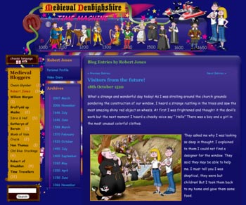
Time Machine Wales is a bilingual website which brings alive Denbighshire's medieval history for children and promotes the medieval sites in the area. The design needed to be colourful and fun to appeal to kids and contains animated characters, sounds and interactive stories. Historical characters are associated with medieval sites which are marked on an interactive map.
Fiona Dolben and the Tourism Team at Denbighshire County Council commissioned this project to make the medieval history of Denbighshire accessible to children. In order to make a link between the present and the past Fiona came up with the idea of two young time travellers who would travel through time and meet the people at the places they lived.
The intrepid young time travellers who update their blog with their experiences and encounters as they move through history. Each century is represented by characters from the time period who tell their stories in a fictional blog. You can read their stories by clicking links on the timeline or explore the medieval world they inhabit in the interactive stories. Famous historical figures were chosen as well as ordinary people such as shepherds and a washerwoman.
The team worked closely during the development. Jo Goigne (Cartoonist) and Charles Kightly (Historian) were meticulous to get the cartoons historically accurate, from the details of the clothing, building materials and equipment to the landscape. Dave Wager and James Roberts (Interactive Designers) designed interactive flash based stories; engaging, educational and fun. They designed soundscapes and sound effects for each story which I was also able to use in the animated timeline.
To realise the project and bring all the elements together I used Wordpress. As one of the most flexible blogging software tools around, it allowed complete customisation, so the interface design and multimedia elements developed for the site could easily be slotted in to the word press engine.
Royal Oak Hotel in Betws y Coed
07 July 2008
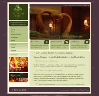
The Royal Oak required websites for their 3 businesses: Royal Oak Hotel, Stables Bistro Bar & Stables Lodge. Although the three businesses needed to be marketed separately, as each has its own branding with a different audience and a different focus, the sites were designed with graphic motifs and page layout that defines the company's overall identity.
The main market is the leisure sector for all manner of different outdoor activities and short break getaways. With an audience differentiated by lifestyle and activity choice, the design for The Royal Oak Hotel should be classic to mirror the clean and professional brand, but have a warmth, to echo welcome and comfort, and a traditional feel, to reflect the unique character of the hotel building and location.
Balancing the contemporary with traditional, use the current logo and typeface but bring it up to date. Reflect the Victorian character in the colour scheme, typeface and design motifs but apply in a contemporary way. Use current colour of green, cream and gold with aubergine to accent with warm texture.
More about Stables Bistro Bar, Stables Lodge
Georgina Rambton Fine Art Portfolio
07 July 2008
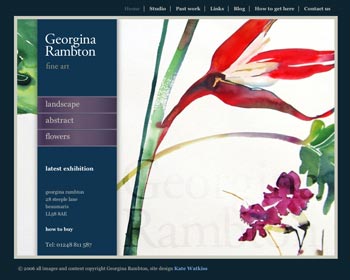
The brief was to recreate a virtual space that is pleasant and inspiring to explore, and reflects the energy of the artwork. The simple layout allows the work to speak, providing a backdrop for the paintings, some of which are rich and vibrant, others intricate and delicate.
The site showcased her work in galleries: plant/flowers, landscapes, abstract as well as displaying information about the artist, studio, news and exhibtions and also her thoughts about her work and practice. The site uses Adobe Co-Author for updates and has been built so that all the content can be edited and new content added.
Your domain name: updating DNS settings and domain transfer
13 August 2008
If you have your site redesigned or change your web hosting you will want your domain to point to the new site. This should be straightforward if you registered the domain yourself and look after your account. If someone else registered the domain for you, you might come across problems. This article explains what you need to know, gives a bit of background about domain names & the DNS, and how to go about solving any problems you come across.
Are you the legal registrant?
Before you start you’ll need to check if you are the legal registrant of the domain. You’ll also need to know the registrar i.e. the company who you registered the domain with, and your user name and password for your account with the registrar.
If you haven’t got this information already you’ll be able to find it by using a ‘WHOIS’ query. You can make a WHOIS query for a domain name by using the following services and entering your domain:
For domains ending in .uk use nominet’s WHOIS service.
Nominet is a not for profit organisation that looks after the registry of .uk domains. See this wikipedia article for more info on Nominet.
For other domains including those ending in .com, .net, and .info use Internic. This will generally give you a referral web address (see note). Go to the referral website and make a WHOIS query from here.
Referral Web Address: The reason you have to go to a different website is because the company you bought your .com (or other) domain from has bought a load of domains ‘wholesale’ from a registry operator Eg. Melbourne IT or Tucows, and has sold the domain on to you. These are known as resellers or retail registrars.
For more detailed info read the WHOIS article in wikipedia
The query will give you the name and address of the legal registrant (hopefully it is you, or someone you know). It will also show the company you registered with i.e. your registrar.
In order to update your domain name with your new website details you’ll need to login to your account. If you have lost your login details you can contact your registrar’s customer services and they’ll be able to help.
If your domain name is in the account of a third party (e.g. your web designer, or consultant) and you no longer want to work with them you can get the domain transfered into your own account. Scroll down for more info on DNS transfers.
If you are not the legal registrant you will need to get the domain transferred to you. Scroll down to read more about changing the registrant details.
Updating your domain records
Login to the control panel of your registrar and change the A record for web hosting and MX record for mail hosting. The A record is the IP address of the computer where your website is hosted. The MX record (or Mail exchanger record) is the IP address of the computer where your email is received. Your webdesigner or hosting company will be able to tell you the IP address for both these records.
How it works: When you type your domain name into a browser (e.g. Firefox) it will find the Name server. This is a big computer that holds the registry where your domain name is sitting. This is where your A record comes in. The name server uses the A record to redirect the browser, across the internet, to your web host, where all your web pages are waiting to be seen.
How exactly you change these records will vary from company to company. But you’ll probably need to go to your list of domain names, click on the one you want to update and look for DNS settings in the menu options. Click here and you should be presented with a selection of settings. Look for A record and MX record and fill in your new IP address. If this looks scary contact your webdesigner and ask them to do it for you!
It can take 24 hours or more for these settings to “propagate” around the internet so don’t worry if you don’t see your new website straight away.
If you have bought your domain through a reseller (e.g. your web-designer or marketing consultant) they may be listed as the legal registrant. If, for whatever reason, they are no longer able to look after the domain for you or you lose contact with them you will need to regain control of the domain by becoming the legal registrant.
You‘ll need to ask the reseller to change the registrant details, For all .com domains this is free of charge. For .co.uk domains they will need to login to their nominet account and initiate the transfer process, which has a £10+VAT charge.
This is the number for the nominet transfer service at the time of writing: 01865 332244. You can also get more information and request a call back from the tranfer page on Nominet’s website:
http://www.nominet.org.uk/registrants/maintain/transfer/
If you’ve lost contact with the reseller you’ll need to prove that you are the legal owner of the domain so the registrar can change the registrant details for you. Contact the registrar and explain the situation. They’ll tell you exactly what you need to do.
Once you have the domain in your name you have 2 options:
- Keep the domain with the current registrar
- Move the domain to another registrar by changing the ‘TAG’
Keep the domain with the current registrar
The simplest thing to do is to keep the same registrar. This is a two step process (substitute [the registrar] for your provider e.g. Namesco, UKreg etc.):
- set up an account with [the registrar].
- send a fax on headed paper saying that you are the legal registrant and you want your domain(s) moving to your account giving the rererence number of your account. Sign it and give the position you hold in your company
They will then contact eh previous account holder and explain they will need to move the domain. The domain will then be ‘Pushed’ into your account
Move the domain to another registrar
You might have good reasons for changing providers. For example you feel the cost of domains, quality of customer service or range of services are better with another provider. Or you have other domains and you want to keep all your domains in one account.
The old provider may charge for this service and the procedure will vary slightly from provider to provider however your new provider will be glad to help you as they want your business!
123-reg gives their customers step by step instructions on how to transfer away from a variety of different providers (see the domain transfer guides under step 1)
This wikipedia article outlines the detailed stages involved in Domain name transfers.
Pobol Peblig website gets accessibility standard
06 October 2008
I’m very pleased to announce that the bilingual Pobol Peblig Partnership website has been awarded the RNIB’s (Royal National Institute of the Blind) See It Right standard for web accessibility. For more information on See It Right, other audits and web accessibility visit the RNIB Web Access Centre.
Our experience of the See It Right auditing process was very positive. It challenged our perceived understanding of web accessibility and allowed us to create a fully accessible solution for our client. The following is an overview of our See It Right experience with some examples of issues we faced and how we solved them.
Background
Pobol Peblig Partnership is a Communities First project in Caernarfon North Wales. Communities First is a WAG program to help and support to the most disadvantages areas in the country. Peblig ward lies in the top 10% of the poorest in the country and is eligible for Communities First support. Tai Eryri has been running the project for 7 years.
The main emphasis of the project is capacity building; building skills, experience, knowledge and confidence of the community members, allowing all developments to be community led. The website reflects this dynamic by playing an important role in communication between volunteers, publicity of events, meetings and activities, sharing resources and ideas.
The Pobol Peblig website was built by Chris Slinn of Free Range Developers and Kate Watkiss Interactive Design. More background information on the Pobol Peblig web build.
Choosing See It Right
Having previously undergone staff development training with the RNIB. The Pobol Peblig staff decided that the new website would benefit from RNIB’s web auditing process.
As we were in the relatively early stages of building the site, we were advised to go for the See It Right development audit. This audit guides the web development process to ensure that the finished site is accessible. The development audit also allowed us to continue building the site as normal and once the first check was done and the solutions implemented, we were able to apply the same rationale to the continuing build.
Audit Process
The auditor goes through the site checkpoint by checkpoint. When examples of failures are found, they are reported, together with the URL, code snippets and a clear explanation of why they have failed and the impact on users. The report gives a comprehensive set of instructions, telling you exactly what to do to make the site accessible and why.
The emphasis on how the issues impact on the user makes the report more that just a set of corrections. Not only does it explain how to make the current pages accessible but it also provides a framework to enable the designer to evaluate problems in the future, helping with decisions on how to tackle issues from functionality to design and layout.
We had 2 rechecks after the initial assessment. And at the end of the last recheck we had an informal email exchange with our auditor, Bim Egan, giving us the chance to tie up a few loose ends (thanks Bim!). The rechecks allowed us to address unresolved issues from the first report and assessed new issues that had arisen during the build.
Throughout the process Bim was available to answer questions. The answers were comprehensive and relevant to the site’s specific problems. If we had reasons for not wanting to implement suggested solutions these reasons were listened to and we managed to reach a solution which was agreeable to everyone.
Issues with our CMS
When the first report came back we were well on the way with the construction of the site and had started to populate it with content.
We’d chosen to use Joomla as it has a quick learning curve for the web authors. This was an important consideration as the staff at Ty Peblig would be taking over the website updates and management. And from the development point of view, Joomla also has the added advantage of a variety of open source plugins from the Joomla development community. We chose to extend the basic functionality with plugins such as the calendar and comment modules.
The CMS and plugins generate html code snippets for menus, and other content modules and components, which slot into the site templates. By working on the site templates we were able to make the overall structure of the page accessible. Once the changes to the site templates were made we were ready to look at the generated code.
There is a strong relationship between accessibility and web standard compliance. If your site meets web standards you are well on the way to being accessible. Good quality code means your site is easily transported to different user agents and technologies. The various Joomla plugins on offer deliver a wide range of functionality, however there are also wide differences in the quality of code generated. The failed code had to be identified and then modified according to the See It Right report.
Other issues we faced related to the way Joomla dictated how information was organised. We found some code blocks were generated that didn’t make sense semantically when applied to our content. However Joomla was flexible enough to allow us to ‘shoe horn’ our content into the system and generate semantic and accessible pages that we could easily style up.
Layout and Semantic Content
For various physical and technical reasons a number of people use the keyboard tab key to navigate through web pages. The order of the code and the layout of information on the page should be such that the tab order is logical, and focus moves smoothly across the page without jumping back and forward.
In our original design we put a search and contact link on the top right of the page. We’d positioned them here partly to conform to convention and partly in order to visually balance the page elements. Since we had implemented a logical code order in our page, positioning the tools to match our conventional layout moved the tools out of the flow of the document. This caused problems with the tab order.
The expected tab order would be to tab left to right through the section links at the top and then through the tools (search, contact etc) at the top right. BUT we also had a context menu down the left. Logically, the context menu came after the section menu in the code. So after tabbing through the top section menu and down the context menu on the left, the focus jumped back up to the top to get to the tools.
Following the advice given, we repositioned the tools to fit under the contextual menu allowing the tab order to move logically across the page. Moving the tools down also provided extra space across the top of the page so the user could increase section link text size without the text overlapping.
Bilingual Content
The Pobol Peblig Partnership website is a fully bilingual website complying with Welsh Assembly Guideline: Publically funded projects in Wales must provide all public communications in both English and Welsh. Because the first language of most of the Peblig residents is Welsh this is a very real, practical requirement.
Coding language changes
Language implementation has a particular impact on screen reader users. When the language of a page changes, it must be coded so the screen reader software can select the appropriate language with which to read the page. It is the ‘lang’ attribute that tells the screen reader what language to use.
The language of an entire page is coded in the ‘lang’ attribute of the html element which surrounds the entire page content and meta information. This means if lang=’cy’ every text string that will be read by a human must be in Welsh, and conversely, if lang=’en’, human read text must be in English. If text occurs in this page of a different language to the page overall language, it must be coded.
We used a language switcher, so there is both an English version and a Welsh version of each page. As the site is dynamic and regularly updated we needed to make sure all articles were translated, if no translation was available there would be a line of text explaining a translation was on its way. As it happens the staff have been entering Welsh and English text at the same time so this hasn’t really been a problem.
How to code everyday Welsh
The main problematic issue was the implementation of ‘bilingual’ project titles and organisation names.
The way the Welsh language is developing, as those living in Wales will know, means that words are being incorporated in everyday Welsh (and English) that are hybrids of Welsh and English. Some of the projects use regional slang Welsh for the project names and these names are used whether the residents are speaking Welsh or English.
An example is the walking project ‘Miglo’. Miglo is a ‘cofi’ word which means escape (or ‘dianc’ in Welsh). Miglo is used in both Welsh and English conversations. Another example is the sex education project ‘Jiwsi’ run by the FPA (Family Planning Association). The name ‘Jiwsi’ is a welsh spelling of the English word juicy.
In both these examples the title can be considered bilingual and can be used in both the English and Welsh pages. In other instances, because our residents only used the welsh project names anyway it was harder to establish if these were really bilingual names.
We approached Bim with this problem who returned with this very practical advice: Ask the question ‘would English speakers refer to the project or organisation with its Welsh name?’, if not, use an English translation followed by the Welsh name, if they would, just use the Welsh name.
Training and Accessibility
As our website is a communication tool for Pobol Peblig and they are in the process of taking over the management it was very important that the staff also understand about web accessibility, the impact it has on users and how to make sure new content they put in is accessible.
The clear explanations and solutions given in the audit have allowed us to easily create training material and give practical advice during the handover period. The staff now have a broad understanding of why websites need to be accessible and the types of usability issues that need to be addressed. We have also covered how to make sure the Pobol Peblig website remains accessible. Ongoing website update training will reinforce the specific accessibility issues as they come up.
Accessible xhtml tables 1: scope, id, headers
11 March 2009
I hadn’t had much call for creating hard core data table in my web design work. However when asked to re-write some xhtml for an online bookings system I found some of the information generated seemed to lend itself to tabular organisation.
So I started to wonder if what I knew about tables and table headers <th> would be enough to make my tables accessible. Would I need to use <tbody> for instance? Is it necessary to use the scope attribute in the <th> element? What is the difference between a summary and a caption?
As it happened I decided that using a table for the data in question wasn’t the most semantic choice, but my appetite whetted, I thought I better brush up my table knowledge… just in case!
How do screen readers access tables?
Bim’s article on the RNIB website (Better Connected, Better Results: Table Headers) has got a great description of a screen reader user trying to navigate a table with no table header or <th> elements. Quite a task involving guessing which table cells hold the key heading information then trying to remember where you are the table and probably doing quite a bit of scrolling back and forth to work out what a particular piece of data represents.
She then goes on to explain how much easier it is when key information is coded as <th> instead of as <td>. When scrolling down a column, the row headers are announced together with the data. And to check which column you are in, instead of scrolling back to check, a keystroke will prompt Jaws to announce the column heading information. Although by default Jaws announces the row header and on a key stroke announces the column header, other screen readers may act differently.
So is <th> enough?
Scope
Do we need to include the attribute scope? I guess it would depend on the type and complexity of data you had to describe. If your table headers happened to be on the second row or second column for instance, it might be unclear as to which data the header described. With scope you can be certain.
What does the WCAG2 say about scope?
Scope can be an attribute of a table cell <td> or header <th>. Its values ‘row’ and ‘col’ (or ‘rowgroup’ and ‘colgroup’ see below) says whether the cell describes a row or a column.
Because the presence of the scope attribute implies the data in that cell is heading data, WCAG2 says you are allowed to use it in both data cells td or header cells th. However its suggested use is for data cells marked up with td that are actually header cells (although I’m not sure why you don’t just use th in this case … )
WCAG2 link: H63: Using the scope attribute to associate header cells and data cells in data tables
Note: The ‘rowgroup’ or ‘colgroup’ attributes are used to say if the header data describes groups of rows <thead>, <tfoot> and <tbody> element, or groups of columns <colgroup> element. See the w3c sample table, more info on rowgroup and more info on colgroup
Id, axis and header attributes
Scope isn’t consistently supported across screen reader technology apparently. So for more complex tables, a more robust alternative to scope is to use the ‘id’ attribute of a <th> and ‘headers’ attribute of a <td> to directly link a data cell to its header. The ‘axis’ attribute also allows you to give more information about your headers e.g time, location, weight, colour. It also allows you to style the table to make the info easier to understand.
Holistic healing work shop example
|
Dining Room |
Morning Room |
Blue Room |
The Orangery |
| Mon |
Flower arranging |
Origami |
Crystal healing |
Pottery |
| Tues |
Egg decorating |
Water colours |
Reflexology |
Yogurt weaving |
<table><br><br />
<tr><br><br />
<th>
</th><br><br />
<th id=“dining” axis=“venue”> Dining Room </th><br><br />
<th id=“morning” axis=“venue”> Morning Room </th><br><br />
<th id=“blue” axis=“venue”> Blue Room </th><br><br />
<th id=“orange” axis=“venue”> The Orangery </th></tr><br><br />
<tr><br><br />
<th id=“mon” axis=“day”>
Mon </th><br><br />
<td headers=“dining mon”> Flower arranging </td><br><br />
<td headers=“morning mon”> Origami </td><br><br />
<td headers=“blue mon”> Crystal healing </td><br><br />
<td headers=“orange mon”> Pottery </td><br><br />
</tr><br><br />
<tr><br><br />
<th id=“tues” axis=“day”>
Tues </th><br><br />
<td headers=“dining tues”> Egg decorating </td><br><br />
<td headers=“morning tues”> Water colours </td><br><br />
<td headers=“blue tues”> Reflexology </td><br><br />
<td headers=“orange tues”> Yogurt weaving </td></tr><br><br />
</table>
What does the WCAG2 say?
If a table data cell has more than one header associated with it (e.g a row header and column header), it must have a headers attribute that lists all of the ids of the associated headers. Thus each header cell must have a unique id.
WCAG2 link: H43: Using id and headers attributes to associate data cells with header cells in data tables
Next up Captions and Summaries!
Q Marketing & PR
03 October 2011
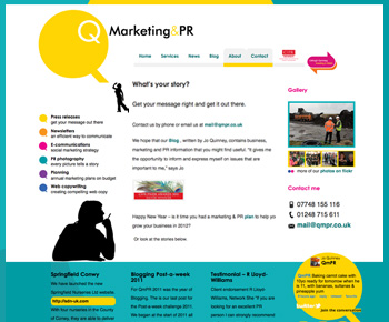
Jo Quinney is a PR and marketing professional behind QMPR an award winning PR consultancy on Anglesey in North Wales. A talented copy writer, Jo felt that blogging would be the best way to demonstrate her experience and achievements and also her diverse passions from PR & marketing communications to environmental and community issues and all the fun stuff in between.
When Jo works on PR and marketing for her clients she will always focus on the company’s brand development and use social media, photography and visual media to give the full picture. So it was really important that Jo’s new website should reflect her passion both in the visual styling and by the inclusion of regularly updated content from her Twitter and Flickr profiles.
Using Wordpress, we created a new blog based website that would bring together Jo’s online profiles and creates a full picture of QMPR services and track record. Although there are wide variety of Wordpress templates available, it was important to create a unique design that would be consistent with the QMPR brand
We worked closely with L29 Creative, who developed the new brand styling and logo, to make sure the web designs were on brand. Jo had a very hands on approach to editing, using scissors and glue to create what she wanted. See her blog post entitled ‘Web Design’ to find out more about the design process and to get some excellent advice on how to approach designing your website.
Ynys Resources
12 February 2012
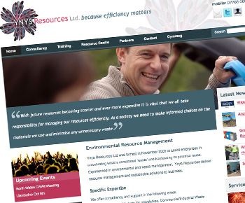
"Because Efficiency Matters” - Ynys Resources provide consultancy services and support for sustainable resource management. Areas of expertise include: Business Development Markets for Recyclables, Recycling and Waste Infrastructure Development, Training in Resources Management and sustainability, BREEAM Assessor (audit service and bespoke advice from interim design to post construction).
A finalist in the Free2Network Green Business Awards, Ynys Resources help businesses save time and money and help the environment by using their resource better and recycling more of their waste. They have a strong focus on helping businesses become more knowledgeable through training and consultancy services, and also by sharing useful information about events, policy changes, new technologies, government initiatives etc.
The new website helps deliver this relevant information about Sustainability and resource management and the benefits to businesses and organisations, an outline of services and case studies describing practical solutions as well as links to useful online resources.
The Ynys Resources graphic styling has been based around the company logo (designed by L29 Creative). The motif within the logo was created by Lily Coley (Rebecca’s sister), an artist who uses found objects and craft techniques in her work. The image is a collage comprising a circular kaleidoscope effect, the composition bringing to mind the delicate butterfly wing or an arial view of a salt marsh.
By using this motif Ynys Resources focus on the human side of resource management where practical techniques and holistic viewpoints encourage businesses to be more sustainable and take responsibility for their impact on the environment. This also allowed us to move away from the conventional ‘eco’ green palette and develop the styling around the muted blue grey accented with dusky pink creating a more modern and professional feel.
The site is powered by Expression Engine which enables the client to keep their clients and partners up to date with the latest policy changes and news by updating all the content themselves. It also gives us completed design control over how the pages are laid out and styled and has allowed us to include categorised content; making organising news stories and resource centre content really easy.
Batchwood School
14 February 2012

Batchwood School is a school for secondary aged pupils with social, emotional and behavioral learning difficulties. The team at Batchwood School had been working internally, developing the teaching and support capacity and working to improve the achievement levels.
Ready to address Batchwood’s external focus, the management team commissioned us to develop their website and marketing materials. The main aims were to provide a platform engage with parents and the community, a showcase to promote the school and it’s activities and achievements and provide quick and easy access to school policies, reports and curriculum information.
The site structure and content was informed by the expected requirements of the main site user groups and stakeholders. Key information such as important info for parents, news and important dates, are prioritised on the home page. Urgent notifications, such as school closure due to snow, can easily be added to the home page and other main pages. Galleries, articles, news and events can all be added easily to the site.
We chose to use Expression Engine to manage content as it allows full customisation of how web pages look, in terms of layout, styling and design, and complete control over how the content is organised.
To make sure the web site visuals and styling matched the brochure and other marketing materials we worked closely with Sarah Norman Graphic Design who designed the new logo and brand graphics, and produced signage, the school badge, brochure and stationary.
The web design is a responsive layout. Using media queries to send specific styles to browsers with different screen widths, the content can be readable on different devices from smart phones to wide screens.
St Tudno Hotel & Restaurant
15 January 2013
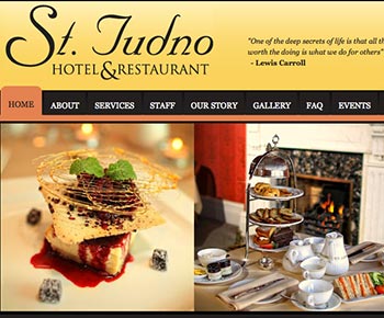
We were ask to redesign the St Tudno Hotel website to help the business to engage with a wider customer base, improve branding awareness, promote special offers, events, new menus, and advertise the hotel's unique Alice in Wonderland connection.
The St Tudno is luxury boutique hotel on a seafront setting with pool, private garden and AA rosette restaurant. The main audience group were over 40 pre and post-retired couples. In order to improve conversion rates it would be important that the design should deliver text readability and an easy to use interface. The hotel wanted to increase the number of family guests within the school holidays and younger couples on short breaks. Promotion of family friendly aspects of the hotel and friendly and open marketing would attract these groups.
The real Alice Lidell stayed in the St Tudno with her family when she was 8 years old, the age at which the Alice stories were created. This role in Llandudno’s Alice in Wonderland connection is a key part of the hotel’s brand. The proprietor has a has a collection of books and memorabilia about the real Alice, and passion for the subject which he needs little prompting to share. The Alice connection would be a unique opportunity to engage with Alice enthusiasts across the globe.
We partnered with L29 Creative to develop the visual design and FLJ Media on the content to ensure the visual design and words matched the branding and style of the business and were in line with the sales and marketing strategy. On going FLJ Media has worked with the hotel promoting the Alice events through the press and and social media.
Plas Maenan Hotel Refresh
04 September 2013
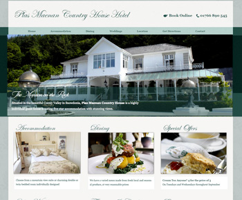
We originally created the Plas Maenan website in 2006. The design was influenced by the light and airy Edwardian styled interior. In need of an update, we refreshed the design to convey elegance and luxury consistent with the hotel's growing reputation.
We took this opportunity to incorporate up to date techniques and styling enhancements in line with the expectations of today’s web users. Examples of techniques and approaches included:
Webfonts - We used webfonts with ‘real’ text for the titles (rather than using graphics). This is good for accessibility, makes it easier to do simple text changes and can reduces bandwidth needed to view pages.
Responsive design - This will ensure all users have a good experience whatever device they are using. It will mean that, ongoing, the site will adapt to future web technologies - this is sometimes known as being future proof (a rather clumsy phrase but one which is illustrative if you take it with a pinch of salt!).
CSS3/HTML5 - CSS3 rules allowed us to add visual and interactive elements without using images or scripting which impacts positively on performance across devices and technologies. We also changed the structure of the page content from XHTML (as it is currently) to HTML5 elements which also improves future compatibility with new technologies.
Photographic banners – Engaging customers with nice photography of the hotel’s interior, gorgeous location and food from the restaurant etc.
Outperform Training & Coaching
14 October 2013
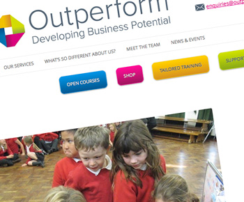
Outperform are a sales training company delivering sales courses, bespoke training and business coaching to businesses in North Wales and across the UK. Test...
When we spoke to Outperform about updating their website, they had lots of ideas but were unsure of how their existing website could do what was needed. Key objectives included allowing customers to book on courses direct, buy supporting resources and get information they need quickly and easily. They were happy with their new logo (designed by Worldspan Creative) and styling but needed a platform that could deliver their objectives.
We chose to use Wordpress for the refreshed site as it is easy to use, flexible and a robust platform for ongoing developments. The team were already using Wordpress.com so were familiar with the interface. It also allowed us to integrate the existing Outperform blog into the new website.
The existing logo, typeface, photos, videos and vibrant colour scheme match the company’s passion, high energy and straight talking style. Using these elements we tailored the template to put across the right message. We created a child template of the Wordpress template ‘TwentyTwelve’. This responsive template was a great starting point allowing us to focus on the core requirements of the project.
Ongoing we have been working with Outperform to manage the site, include new content, updates and developing features such as their new product catalogue for sales training CDs and resources.
“I just wanted to say thank you for all your help with the website it looks great and your flexible approach has meant it was a pretty seamless transition to get where we wanted to be.
We particularly liked the fact that you were highly responsive, adaptive to last minute changes, requirements and also committed to finding solutions to meet our needs even if they were unusual requests. This has resulted in us getting a website that absolutely meets our needs, reflects our personality and contains unique aspects. Thanks Kate”
Dawn Roberts, MD Outperform
WPML versus qTranslateX – a Clear Winner?
15 June 2017
All over the world people use multilingual websites so they can get information they want in the language they prefer. Closer to home, in Wales, a large minority of web users prefer to access content in Welsh. For this reason, many businesses and organizations in Wales provide bilingual websites giving their visitors the choice to read Welsh or English.
All over the world people use multilingual websites so they can get information they want in the language they prefer. Closer to home, in Wales, a large minority of web users prefer to access content in Welsh. For this reason, many businesses and organizations in Wales provide bilingual websites giving their visitors the choice to read Welsh or English.
When building a bilingual website there are different approaches to consider depending on what the project needs.
For WordPress, a popular choice for managing websites, handling bilingual content is done through addon plugins. I tend to use either qTranslateX or WPML. Which one I’d choose would vary from project to project. As well as the project spec, an important decision factor is the experience and preferences of the team involved in looking after the website.
Comparing the 2, on balance I prefer qTranslateX. I’ve used both plugins on a variety of projects and qTranslateX just feels easier. Easier to use and easier to integrate with other plugins – a simpler way of doing things. When I have to do something new with WPML it usually feels like a mission to work out how to do it, whereas with qTranslateX everything’s where you expect it to be. But in the end they both do a great job of managing a bilingual site.
Chalk or Cheese?
A fundamental difference between the 2 plugins is that WPML creates a new post for each translation while qTranslateX uses just one post to hold both languanges. This offers pros and cons with different situations and set ups.
WPML provides a comprehensive framework for multilingual content, and it feels complicated. Translation is done through various interfaces within the framework and it can be confusing to find out where to enter a translation. That said the support team and forums are great, and you’ll find most of the issues people come across are fixable – either by changing or refining the settings, or finding out where something is translated.
To take advantage of all of WPML’s features you need to install a suite of plugins which will allow translation of everything including media items such as images and galleries, and slugs (the URL address of each page). Some of the bigger plugins like WooCommerce, Yoast SEO and Event Manager have plugins that interface with WPML creating extra admin fields for translation.
QTranslateX, on the other hand, uses ‘languange tags’. These tags allow you to add multiple languanges in the same post, or content type (e.g. menu items, custom post types, categories, other taxonomies). So adding a translation is done there and then on the same screen. Most of the time You can switch between languages using the WYSIWYG language tabs and you’ll never see the tags at all.
Occasionally, you might find one of the plugins you’ve got installed hasn’t got the language tabs set up on an editable field. If this happens you can simply enter your translation using language tags – they look like this: [:en]Welcome to Wales[:cy]Croeso i Gymru[:]. This is a quick handy work around, just pop in the language tags and [:fr]Voila![:]. When you’ve got a bit more time you can make your field translatable in the Advanced Settings.
Translating pages or posts.
With WPML you first create your post in one languange. When you’ve finished writing your post and saved it, the ‘plus’ icon in the Languages box shows you that you need to add a translation. Click this and it creates a new post. There are buttons to either ‘Copy content from [Welsh/English]’ or ‘Overwrite with Welsh Content’, handy if you’re translating directly in the editor window. When the translation is saved, and has been correctly linked with its sibling, you can click between the languange versions.
In qTranslateX both translations go into the same post. There are tabs within the edit window which allow you to click between the languanges. Click ‘Publish’ or ‘Update’ and this saves both languages. Simple.
Translating your theme and plugins
Most themes usually allow you to change the text pretty much everywhere, but there may be things like buttons or forms labels for instance, that are hard coded in the templates. When you test the website, you realise they’re not translated. This is where WPML’s string translation comes in. WPML > String Translation will list all strings and show if they’re translated or not. Use the search box to find your string and click translations to add your translation. (‘String’ is a term for a string of letters or numbers that are human readable i.e. a word, or a phrase, or a sentence).
qTranslateX does it a different way. Instead of the ‘String Translation’ tool, qTranslateX relies on the special language files that WordPress use for ‘WordPress in your language’. These files hold all a list of all the ‘strings’ with a translation for each string. These files are are MO (Mobile Object ) files and are made with the open source gettext language framework.
California Dreamin’ …
…The MOs & the POs (and don’t forget the POT)
In a nutshell, by using the gettext framework, WordPress provides language files for over 160 languages. Teams of volunteers contribute to the language files to make sure they’re up to date with the latest version. Plugin and theme developers are also encouraged to provide a language template (file extention .pot) and some language files (which have file extention .mo and .po). If your language isn’t there you can us the template to add your own language.
How does it work? And what’s POT, PO, MO?
1. POT – Portable Object Template:
The POT is made by the theme or plugin developer. It is simply a list of all the strings (messages, labels, phrases etc) used in the theme or plugin.
2. PO – Portable Object:
Using the POT the translator will create a PO for their language by adding suitable translations for each phrase. A theme often ships with a few PO files already translated for popular languages.
3. MO – Machine Object:
The PO is then compiled into a MO file that can be read by computers and is used by WordPress to display the website in the correct language.
The MOs and POs are provided with the plugin or theme in the language folder.
If you find an untranslated string it can be added to the MO file using tools such as POedit. For further reading check the WordPress website: [https://developer.wordpress.org/themes/functionality/localization/](https://developer.wordpress.org/themes/functionality/localization/)
Translating your menus
In WPML you need to create a separate menu for each languange. You use the menu translation and menu syncing features to set the languange, and link the translated menus together. Follow the instructions on their website carefully! The menu sync feature is a good idea, allowing you to compare the 2 menus and correct any discrepencies. But it can lead to unexpected results, again follow instructions carefully.
QTranslateX uses the language tab toggle within the menu editing screen. You have just one menu. Menu items are translated behind the scenes with the language tags within the menu items. For a while (round about the release of WordPress 4.5) this was buggy for large menus, but the team has fixed this.
Translating categories and tags
Don’t forget the milk [white, drink, calcium]
For content writers and editors this area seems to be a sticking point. They are used to choosing and adding new categories and tags from the post editor when adding a post or page. But translating the tags and categories often gets forgotten. This is probably because in both plugins you have to leave the post/page editor to translate categories, tags and other taxonomies. For both plugins you need to go to categories/tag editor. WPML also has a separate Taxonomy Translation screen to allow you to manage translation of all taxonomies in one place. Until a better way of doing this is released, it’s going to continue to be a training issue.
Translating slugs
Slug translation is integral to the way WPML works. Because of the way it creates a separate post for each language, it automatically creates a different slug for each language.
e.g.
[mywebsite.com/en/about](http://mywebsite.com/en/about)
[Mywebsite.com/cy/amdanom](http://mywebsite.com/cy/amdanom)
With qTranslateX the slug is the same for each language. While there’s a plugin you can install to translate the slug, I’ve not actually used it myself. I’ve never found a good enough reason use it. For each plugin you add to WP you increase the system bloat, making it increasingly difficult to keep software to date. Anyhow my feeling is if slug translation is important to your project, use WPML.
In summary/ In a nutshell/ round up
qTranslateX is free (although donations are welcome), so this might be a clincher for some people. It’s also a bit more hands on: customizations can be added through the functions file or directly in the templates. And the language tags can be used to add quick and dirty translations. For additional translations to theme and plugins you’d need to update your MO language file. For support you need to use the forums.
WPML is a pay-for plugin (cost $79 annually, $199 unlimited). It can be confusing and complicated to get new features set up. On the plus side, they have a great support team, where you’ll get an answer to your problem, if it hasn’t been answered in a previous thread. And there’s an interface to do most things you need to do.… Once you found out where…
Outro
While researching this blog I checked back to the grid on the WMPL website that compares WPML to alternative language plugins ( [https://wpml.org/home/comparing-wpml-free-paid-alternatives/](https://wpml.org/home/comparing-wpml-free-paid-alternatives/) ). The grid shows that while WPML does ‘everything’ on the list, qTranslateX only does ‘basic translation controls’. As you might guess, this is not the whole story. To be clear, for WPML to do some of the things in this list, you’d need to install an add-on plugin (e.g. string translation). Plus, some of the things (that this grid says qTranslate can’t do) are available in qTranslateX (e.g. menu translation) or can be done with a plugin (e.g. slug translation). However that aside, it’s qTranslateX ‘basic translation controls’ that make it so attractive!
Buying all versions of your domain name
19 April 2019
Should you buy various versions of your domain name, and if so which ones?
The last bit of a domain name (.com or .uk) is called the top-level domain or TLD. Country code TLDs (ccTLDs) are the domain names that represent a country such as .uk (United Kingdom obvs), .fr (France), .us (USA), and so on. There are now many generic TLDs such as .online, . shop or .xyz.
The shorter .uk domain was automatically made available to owners of the respective .co.uk domain for a 5 year period starting in 2014. So you may already have it in your account. If you decided you didn’t want it and let it expire it then it would become available on the open market for anyone else to buy and use.
Should you buy .uk or .co.uk if both are available and you only want to register one?
.uk is shorter, so quicker to type, say or read. It’s also newer… so may be viewed as up-to-the-minute, contemporary and ‘cool’.
By the same token .co.uk or .com may appear more serious or established.
If you’re starting a new venture and the .com and .co.uk are long gone, the new generic names may also give you the opportunity to buy a version of your preferred domain name.
In 2015 .cymru and .wales* also came on the market. They’re useful for businesses in the tourism and leisure sectors as well as those who want to display their welsh connection and heritage.
*Note: Nominet the uk domain name registry also look after wales domains and a number of other TLDs e.g. .london or .bbc
It might just come down to preference and what intuitively works for you and your brand.
Some people prefer to stick to one domain as it’s simpler and cheaper. They’re happy to build their brand and SEO on one domain. On-page optimisation such as useful content, accessible and mobile friendly pages and quality code, as well as good quality inbound links will help Google ‘see’ their site and ensure it does well for their sector and chosen key words.
However having additional TLD versions gives you control over your brand. What if someone types in the wrong version of your domain name by accident? You can use web forwarding or set up an alias to ensure they’ll still get to your website.
In addition you can stop ‘cybersquatters’ or your competition using your domain name. Unscrupulous individuals can snap up your domain and copy your site to display ads, steal your customers or scam site visitors. By registering the domains that are most relevant to your brand – for UK businesses .co.uk .uk and .com – you can stop this happening.
So in summary:
Keep things simple and cheaper and focus on one domain
Or
Protect your brand and stop cybersquatters by registering your preferred versions
Access All Areas
02 February 2022
I’ve been working with Ensemble Cymru since 2015, supporting Peryn and his team to update and look after their website. It has been really great to work with such a creative and enthusiastic organisation.
A huge part of Ensemble Cymru’s work is about bringing Welsh communities together to enjoy outstanding music, increase wellbeing and enable positive change… and that commitment extends to our website. We want to make sure that everyone can access our website so we’ve spent the past few months working on a redesigned website that has access at its heart.
What is web accessibility and why is it important?
Web accessibility is the process of ensuring website content can be accessed by everyone whatever barriers they may face. Some people might be restricted by technology: they may have slow Internet, especially in rural areas like north Wales, or they may be using an older computer running old software.
Some people may have physical challenges. Users might use a mouth wand to operate their computer keyboard or eye tracking software. Others may prefer to use the keyboard because they struggle to hold and point a mouse accurately, or they may have reduced vision and need large clear text. Bright pink text on a purple background may look super funky but it would be totally illegible! Other people access web content with a screen reader that reads out loud the text that’s on their screen, while deaf or hard of hearing users rely on transcripts of audio or video content.
We also need to make sure that the website works for those using the latest smart phone with its touch screen, light sensor, accelerometer, face ID and more! Many modern phones have accessibility features built in now too, like Apple’s VoiceOver screen reader programme or Siri which provides voice activated commands.
The key in designing for accessibility is to always have our users in mind. Our website must be usable whether our users are using a fancy wide screen monitor, or a bells and whistles smart phone. The content must still make sense when viewed on the most basic text version or when accessed using a screen reader (which reads the content out loud for a visually impaired user).
Visual Design, Colour and Contrast
The accessibility guidelines play an interesting role in the creative process. We need to interpret the Ensemble Cymru visual branding in a way that ensures consistency and recognition of the identity, while also conforming to accessibility tests. For example, we explored colour combinations that have sufficient contrast. The bold palette chosen both passes the threshold accessibility values and reflects the vibrancy and passion inherent in this small organisation.
Responsive Pages
One of the important things to remember about accessibility is that many people who have a disability will be using the same technology as everyone else, but they will be using it in a slightly different way.
For example someone who is partially sighted might use their laptop with text size set to extra large to enable them to read comfortably. So we must make sure our page design is flexible enough that text size can be increased without breaking the layout: elements must not overlap or be pushed outside the page boundaries.
Nowadays, as people browse the internet on a whole range of mobile devices, web designers create responsive layouts as a matter of course: we design our pages so they respond to varied screen sizes and resolutions, stretching, shrinking and reorganising content elements accordingly. As well as testing on different screen widths, we also change the text size and test different combinations of font and screen sizes to ensure our layouts don’t break and content is easily readable.
Mouse, Keyboard or Touch
We need to make sure that users can interact with content. Many modern devices include touchscreens as well as the more traditional mouse clicks and keyboard controls. Users should be able to navigate through interactive elements (links, buttons, form entries etc) and be able to select and activate the element as needed.
In order to give full access to users who can’t use devices that rely on hand eye coordination, like a mouse, all content should be accessible only using keyboard commands. For example think of a dropdown sub menu in a navigation bar – for a dropdown to be fully accessible it must be possible to open, navigate and close it using only the keyboard. This process is sometimes overlooked by developers who only allow the submenu to be accessed on a mouse hover.
Images and Alternative Text
For users with visual or cognitive disabilities alternative text can help them understand the meaning or function of an image. We use the ‘alt attribute’ of an image tag (alt = alternative) to provide text information about an image, or place a caption or descriptive text next to the image. A screen reader will read out the alt text. If the image fails to load or the user is browsing with text only, the alt text is displayed on the page. So it’s important to consider the passage of text and ensure the alt text makes sense in the location it is positioned. We need to make sure that it flows and is helpful to the reader. Badly written alt text can sound clumsy or incoherent, at worst it can be confusing or misleading.
The Basic Building Blocks
Headings provide a description of the following content. Busy users can scan the headings in a page and quickly get an overall understanding of what the page is about. Screen reader users can use page headers in the same way by skipping from heading to heading.
Lists provide a quick and efficient way to group similar items e.g. a list of dates or events, instructions, terms and conditions.
Links are the connections that make the internet a interconnected World Wide Web! Using well-written link text can make all the difference in helping users navigate to where they want to go.
These basic elements when used correctly provide a strong foundation for an accessible webpage. Layered on top of that we have our visual design and interactive elements. These can make our content user friendly, visually appealing, and intuitive to use. However we must be careful to be aware of our users when adding each additional layer of complexity. It’s all too easy to get carried away creating a bells and whistles interactive platform with appealing and exciting design – but this has to be considered alongside accessibility.
Meeting Web Accessibility Standards
In order to measure Internet accessibility a set of standards have been developed. They are called the ‘Web Content Accessiblity Guidelines’ or WCAG. We have decided to use the WCAG double-A Standard to guide the redesign and we’ll be doing a WCAG audit to check all parts of the site meet these standards making Ensemble Cymru’s website accessible to all our users.
Ensuring that everyone can access Ensemble Cymru’s work is really important to us – we’re committed to increasing access and breaking down barriers that prevent people from enjoying music, creativity and collaboration across Wales. We hope you enjoy the new website and if you have any feedback on accessing our website we’d love to hear from you.
Credits
Thanks to Laura Twemlow (Co-Director, Change Creation) for editing this post. Her brilliant way with words have refined my ramblings and hopefully made some of the more technical bits easier to understand. A shorter version of this article is available on the Ensemble Cymru website in both Welsh and English.
© 2026 copyright Kate Watkiss.